
Origins
UX Researcher and Designer
Client -
Role -
Origins Cannabis
UX Researcher and Designer
Location -
Redmond, WA
I worked with shareholders and the COO in-person to help research why customers are having issues or can't use their app properly. I was able to conduct in-person interviews and gather data from real customers. I was able to create a new design for the product display along with altering the information architecture to fit the user's needs. I conducted usability testing with the customers in-person and gathered feedback on my design.
Brief -
Marketing Strategist and Designer
About -
Origins is a local cannabis shop in my area that I started working at in July of 2022. They specialize in helping those who are new to cannabis or want to explore the world of cannabis, every age.

Origins App Redesign
Client Briefing -
Identify the Issue -
Proposed Solution -
They wanted to make their app look cleaner and flow better with in-store operations to increase sales
Understand why users are having technical issues with the app
How can we bring more interaction to the store even if not related to buying product
Want to create better marketing for their app
Take user feedback and create an interface that displays information properly while maintaining an organized appearance.
Make sure the inventory, server, and in-house system are properly connected and information is entered correctly.
The store doesn't clearly or consistently display information about the product
Pricing generally is displayed incorrectly or sales aren't displayed
Menus and filters need to be reorganized
The shopping cart exceeds proportions of the screen and doesn't display pricing correct
The blog and messages serve little purpose and can be removed, replaced, or minimized
Include a new section that creates more interaction with the app. For example, an education or reviews section.
Problem Overview


"Cluttered Home"
"Incorrect Price"
User Interviews -
User Personas -
I conducted individual interviews with a variety of customers. I gathered quantitative data through user surveys, distinguishing between active and inactive users.
I developed multiple personas representing each key age group, which helped effectively communicate to the shareholders the unique needs and preferences of each demographic.
Competitive Market Analysis (SWOT) -


I researched competitor websites of local shops as well as the top-performing store in the state to gather insight on the content layout and overall structure.


Strengths
Weaknesses
Opportunities
Threats
What makes our app unique and functions better than other competitors?
What makes our app function and look worse than our competitors?
What do the competitors do better than our store?
What can we do to get ahead of our competitors using new innovations?
Research Approach
Wireframes-
Information Architecture -
For my wireframe, I began by sketching the current layout in pencil and experimenting with the placement of various page functions. My design process was guided by insights from user research and an analysis of competitor designs.
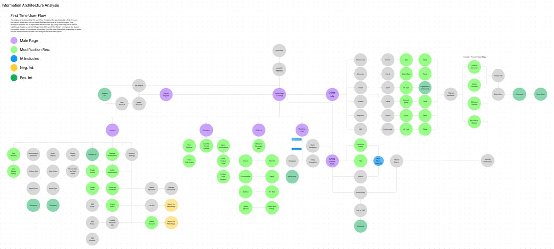
The information architecture has several issues, with a major concern being that many filters either led to no products or returned incorrect products.
User Flow -
This allowed me to identify key pain points and present potential solutions to the shareholders. It also helped illustrate how certain issues could negatively impact a user's experience, making it easier to convey their significance.


Design Decisions
Low Fidelity Prototype -
Design Format -
My low fidelity iteration helped me design the base of the my final design through my research. This helped me gather the thoughts of the shareholders on my designs. I crafted the main product screen and gathered feedback from customers and shareholders.
Using the company's colors and understanding the typography were key for proposing realistic iterations.
Font and Color -


The company's colors were based on their lifestyles branding that has been with the company since the start. They have produced merch and other designs based in these colors that could be used in marketing and within the app.
The Orange, Dark Brown, White, and Tan were the main colors within the app and where I maintained my focus. I wanted to make sure that my design reflected the rest of the app.
Typography -
Throughout the app they use one singular font besides visuals, Oswald. They use the font scaling 30px, 20px, 16px, 14px, 10px, 8px.
ORIGINS CANNABIS
Aa Bb Cc Dd Ee Ff Gg Hh Ii Jj Kk Ll Mm Nn Oo Pp Qq Rr Ss Tt Uu Vv Ww Xx Yy Zz
ORIGINS CANNABIS
ORIGINS CANNABIS


Colors -
Design Iterations
A/B Testing -
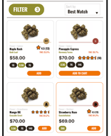
I crafted multiple variations of different product displays to gather opinions of what customers liked. Customers liked the review system being displayed.
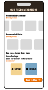
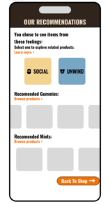
I gathered feedback on the depth of the "Guide me" section and created a more in-depth system with a new layout for the results



Product Display -
Guide Me Results -
Redesign of User Flow -
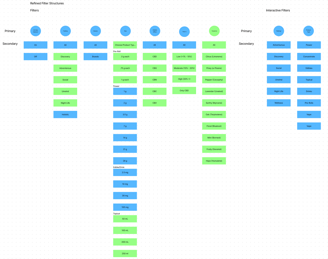
Refining the information architecture and user flow was essential in reimagining the new set of menus and pages to seamlessly align with the app's needs.
Redesign of Filters -

Prototype Testing
High Fidelity Prototype -
This is the final iteration of my proposed design, adding more depth to certain features while organizing the app to make it more interactive and functional.


Results
If you would like a closer look at the User Personas or High Fidelity Prototype with an interactive flow please use this Figma link below:


